
Many cities around the US have adopted electric scooters to fill short-distance transportation gaps in urban life. Nevertheless, many local policymakers assessing the viability of e-scooters in their transportation system have identified that an uneven spread over the city severely limits the access for many community members to this cost-effective alternative mode of transportation.

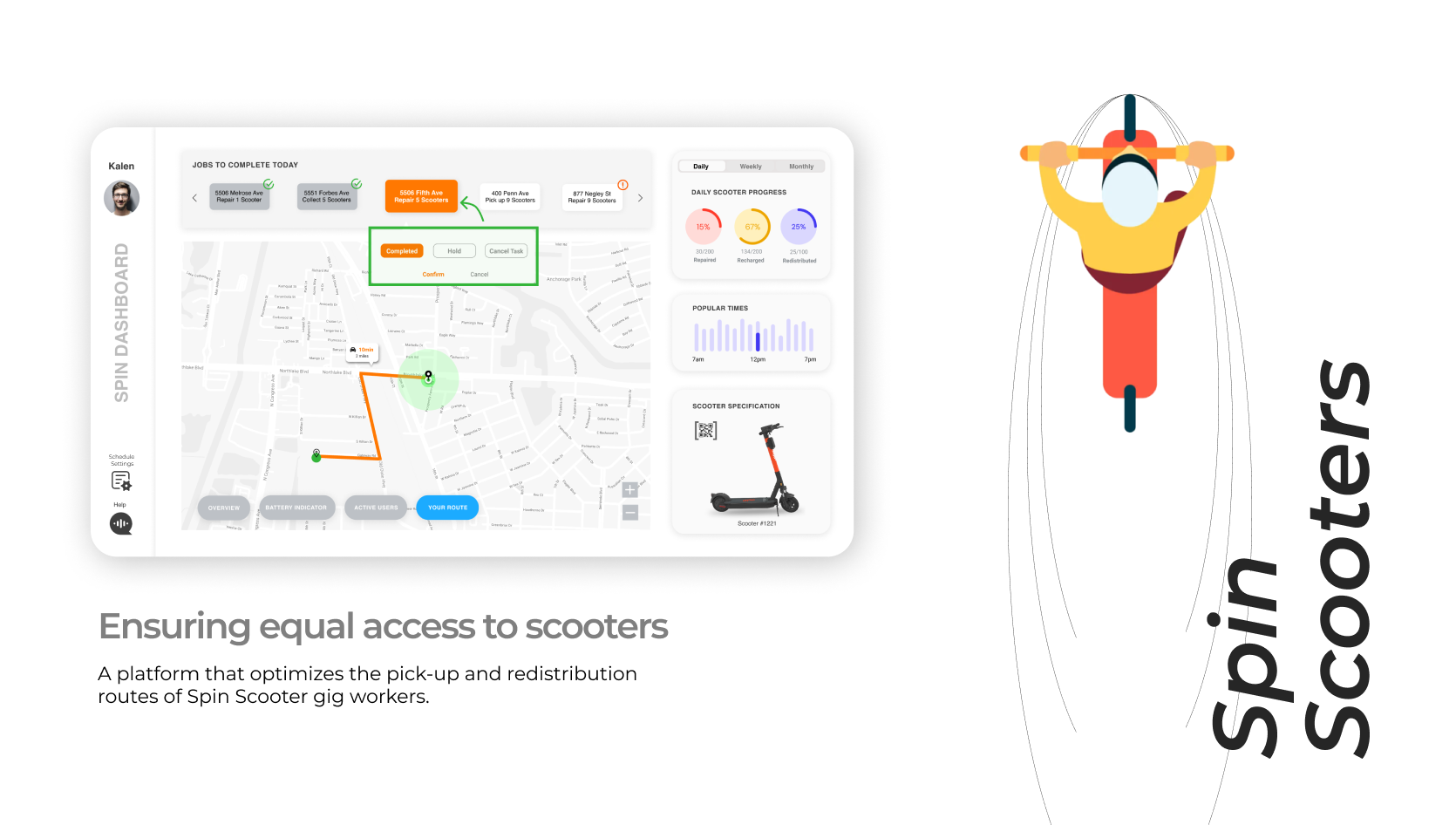
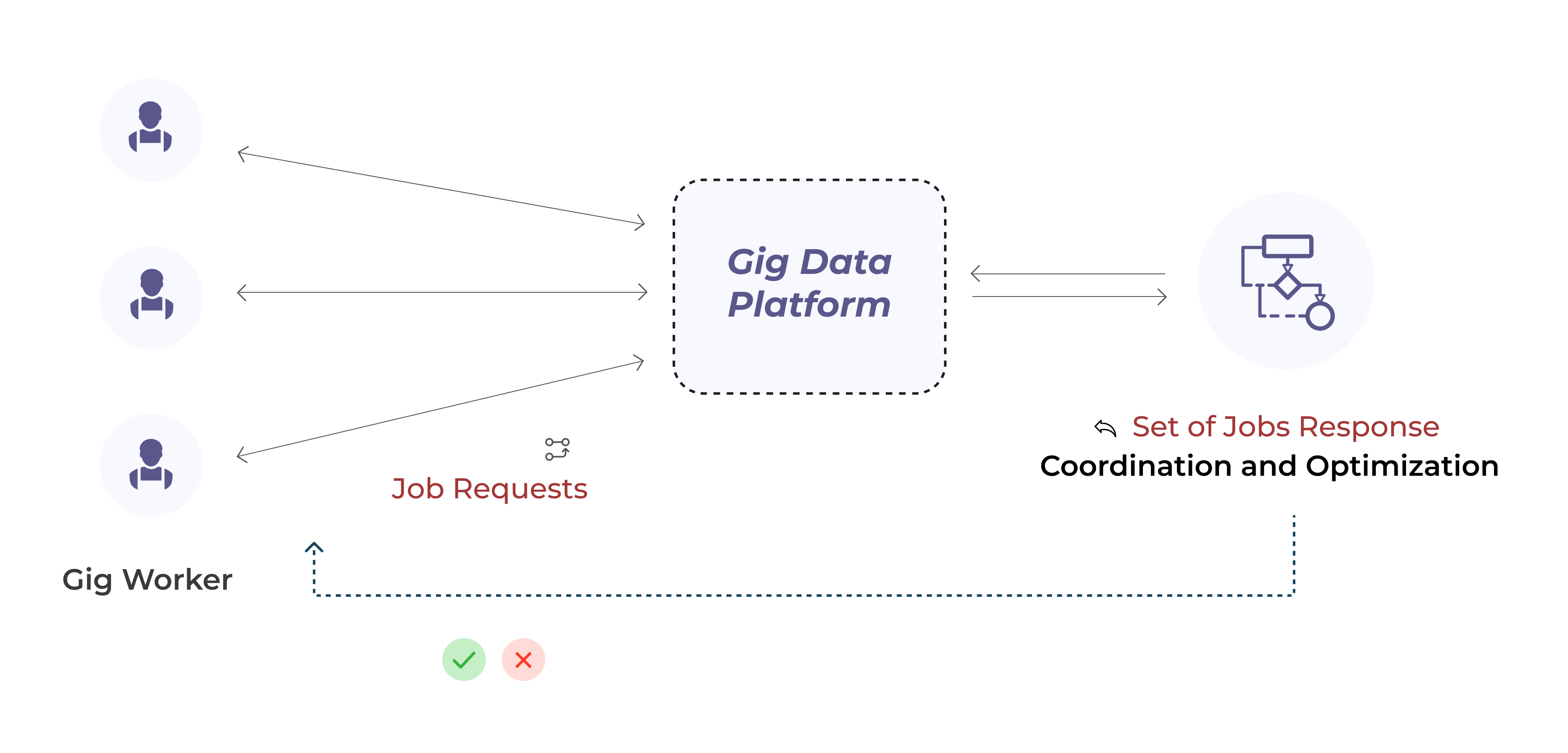
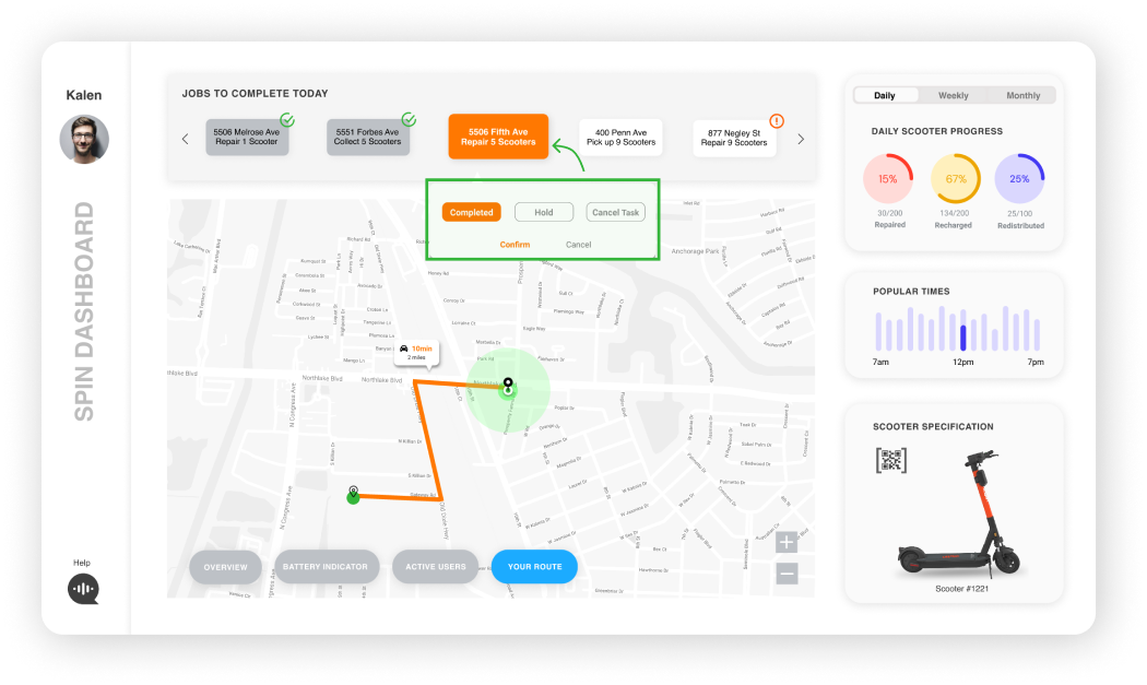
A data platform that empowers Spin Scooters gig workers with algorithmic decision-making. The platform coordinates all the gig workers based on the individual, company, and city priorities and calculates the optimal pickup and redistribution route allowing the gig workers to evenly distribute the electric scooters across the city. Job progress insights and visualizations allow the gig workers to quantify their effort and follow the desired path.
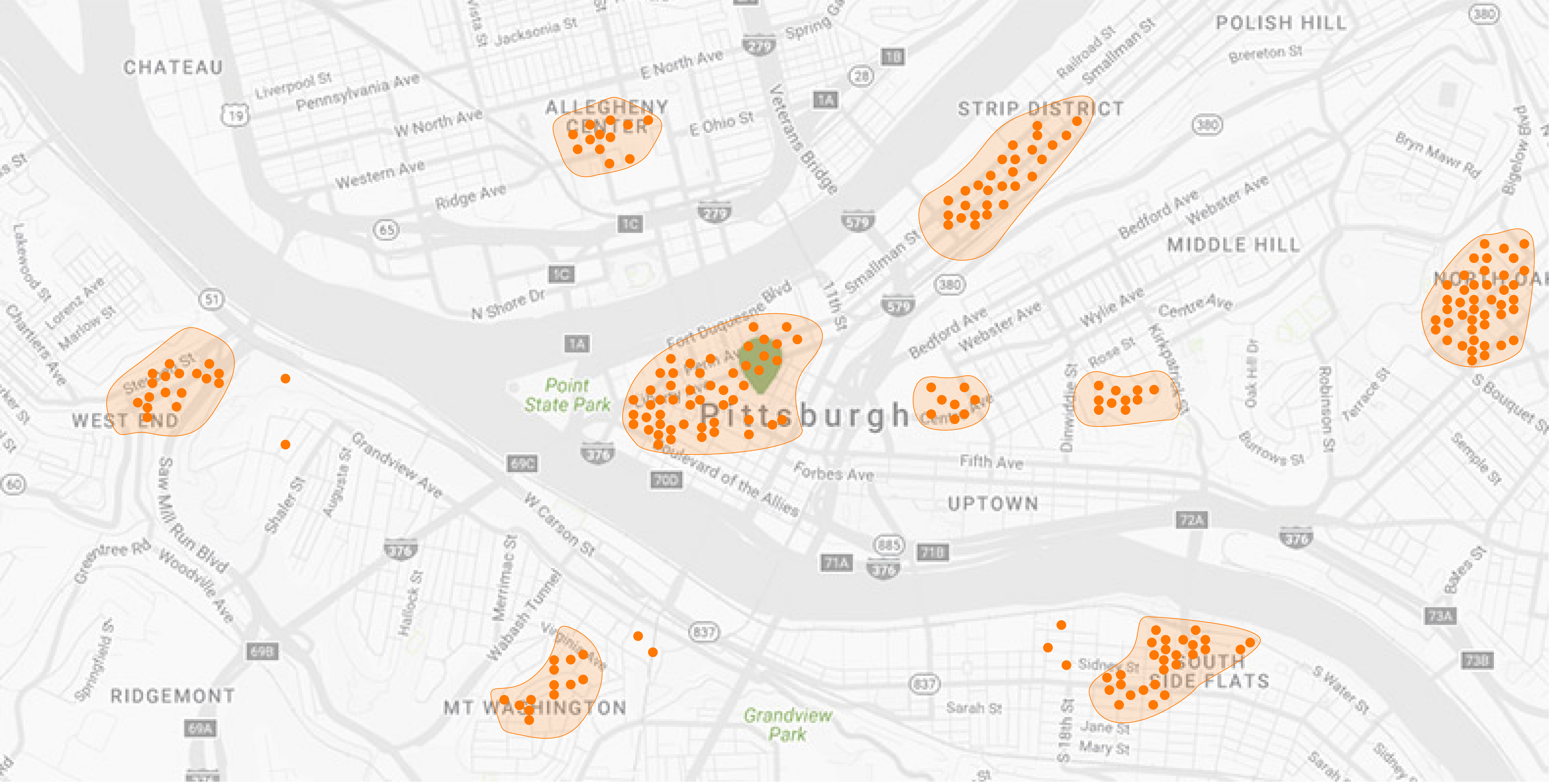
Electric scooters are usually aggregated in some locations; whereas, other locations are left empty, making access to them uneven or unreachable. Current solutions to this problem initiated by competitors include employing full-time employees or introducing a scooter "reserve" feature, both of which fail to take into account the needs of the gig workers or the city.
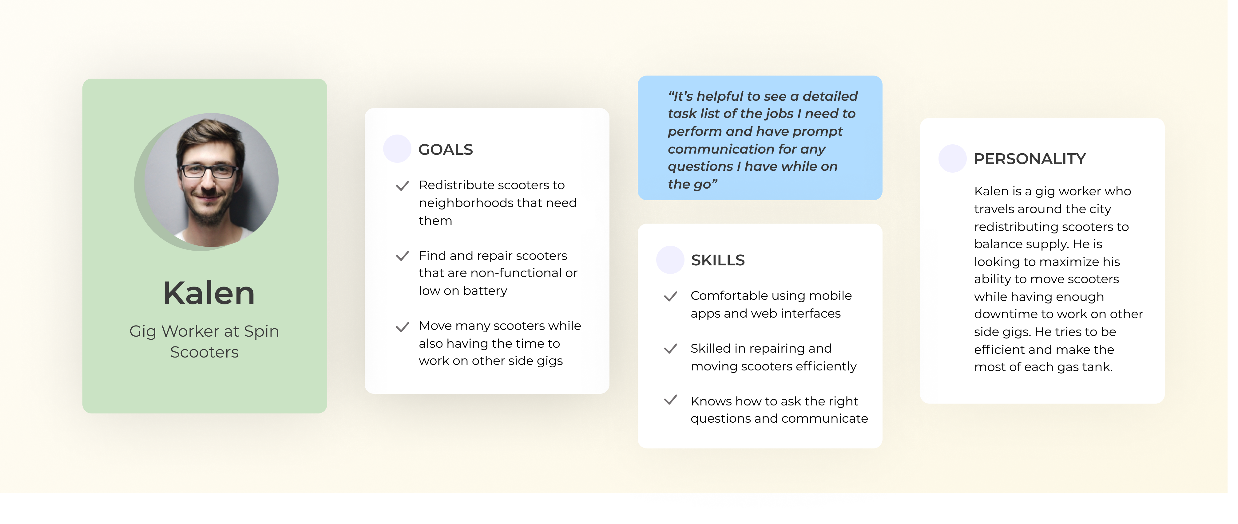
Gig workers are employed by Spin Scooters to facilitate the distribution and upkeep of its scooters. For gig workers, their main goals are to have a flexible schedule where they can use this job as a side-gig to make some extra income. However, they are not provided the right management model to complete their jobs effectively.

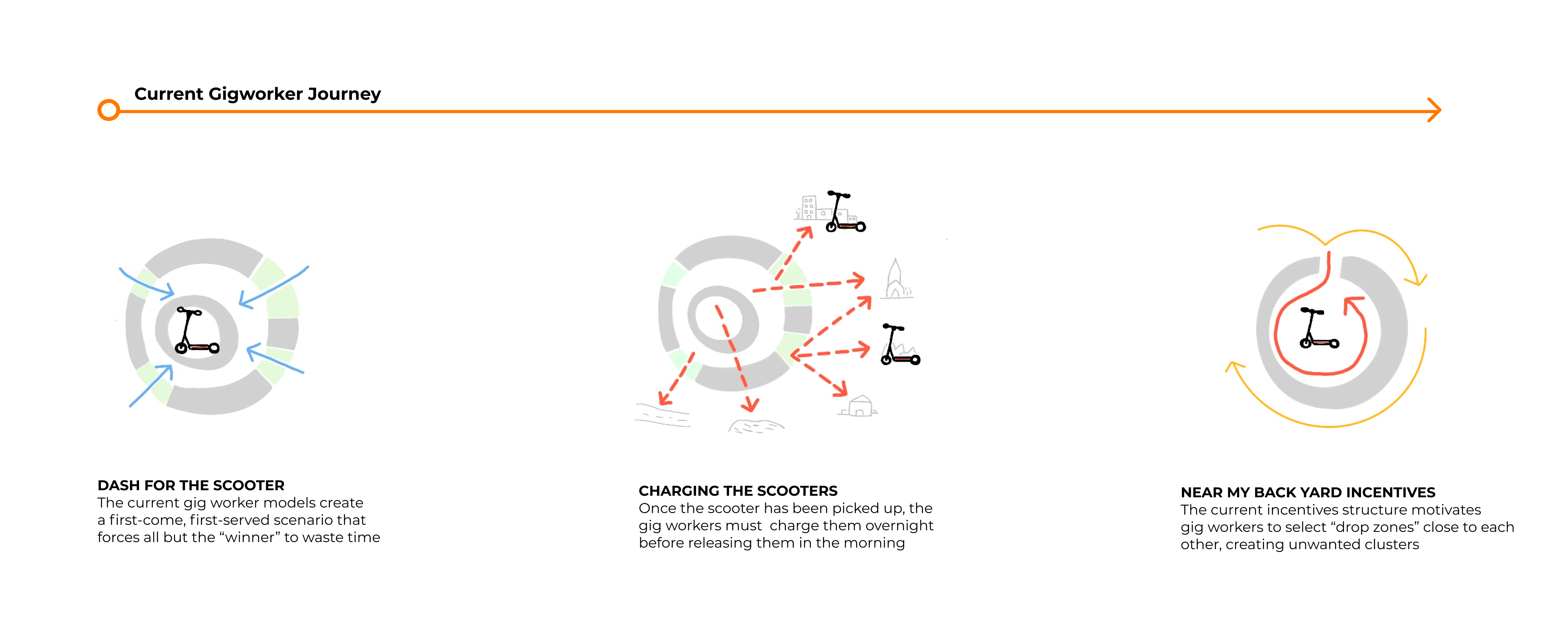
Due to a lack of coordination between the gig workers, they tend to pick up and drop off scooters at the location that is most convenient for them (i.e. their nearest and most profitable locations). This creates clusters of scooters in some locations instead of ensuring an even distribution throughout the city.

The design proposal is a comprehensive dashboard that uses an optimization algorithm that takes into consideration the preferences specified by the gig workers via a job request as well as company requirements (i.e. maximizing scooter ridership and revenue generated). The algorithm then responds to each individual gig worker with a list of tasks that they can accept. This ensures an even distribution of scooters across the city while maintaining a gig worker economy.
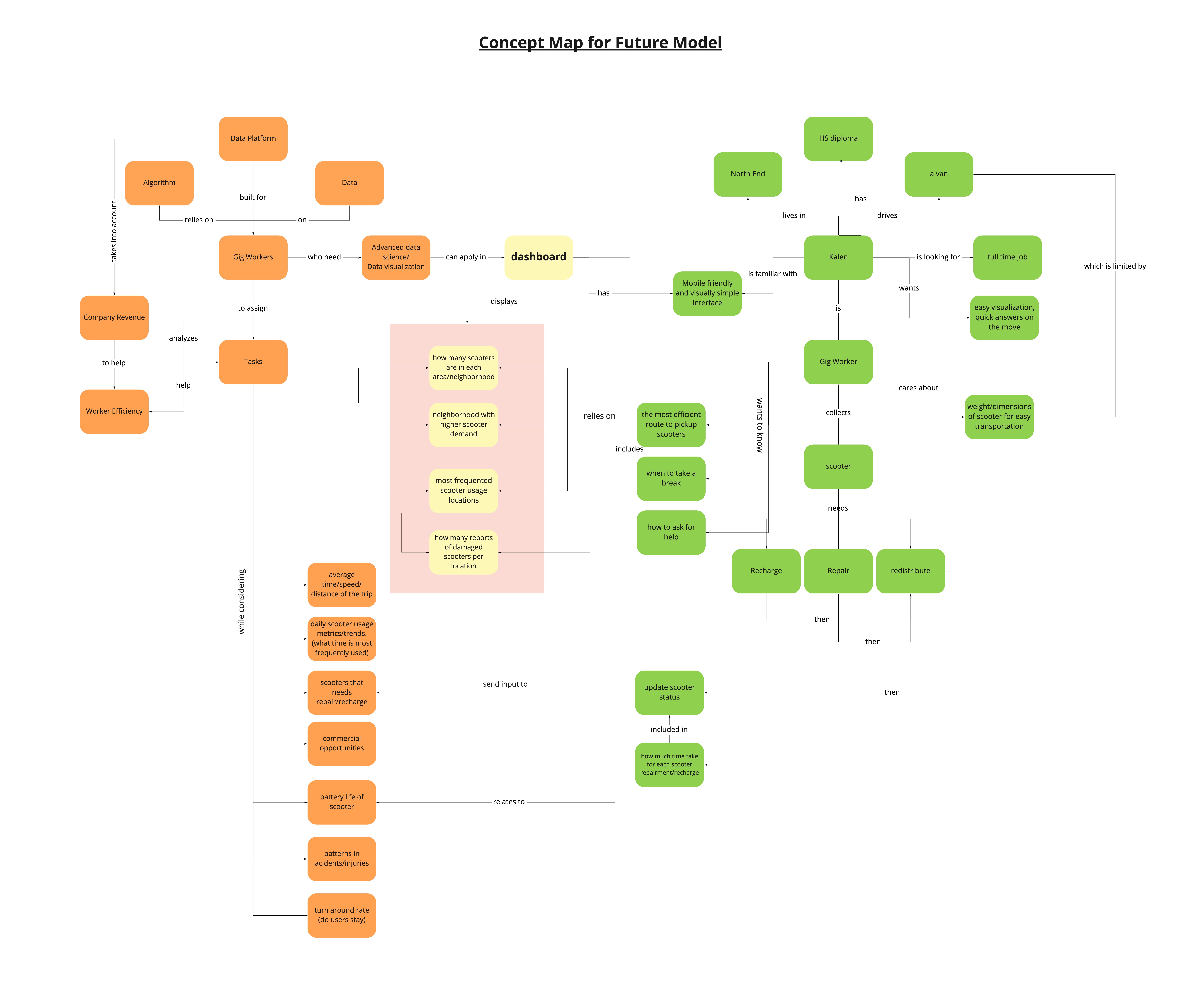
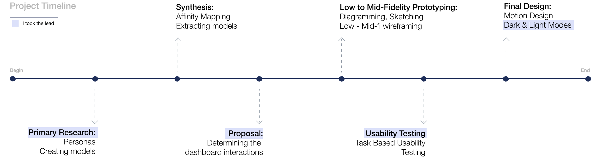
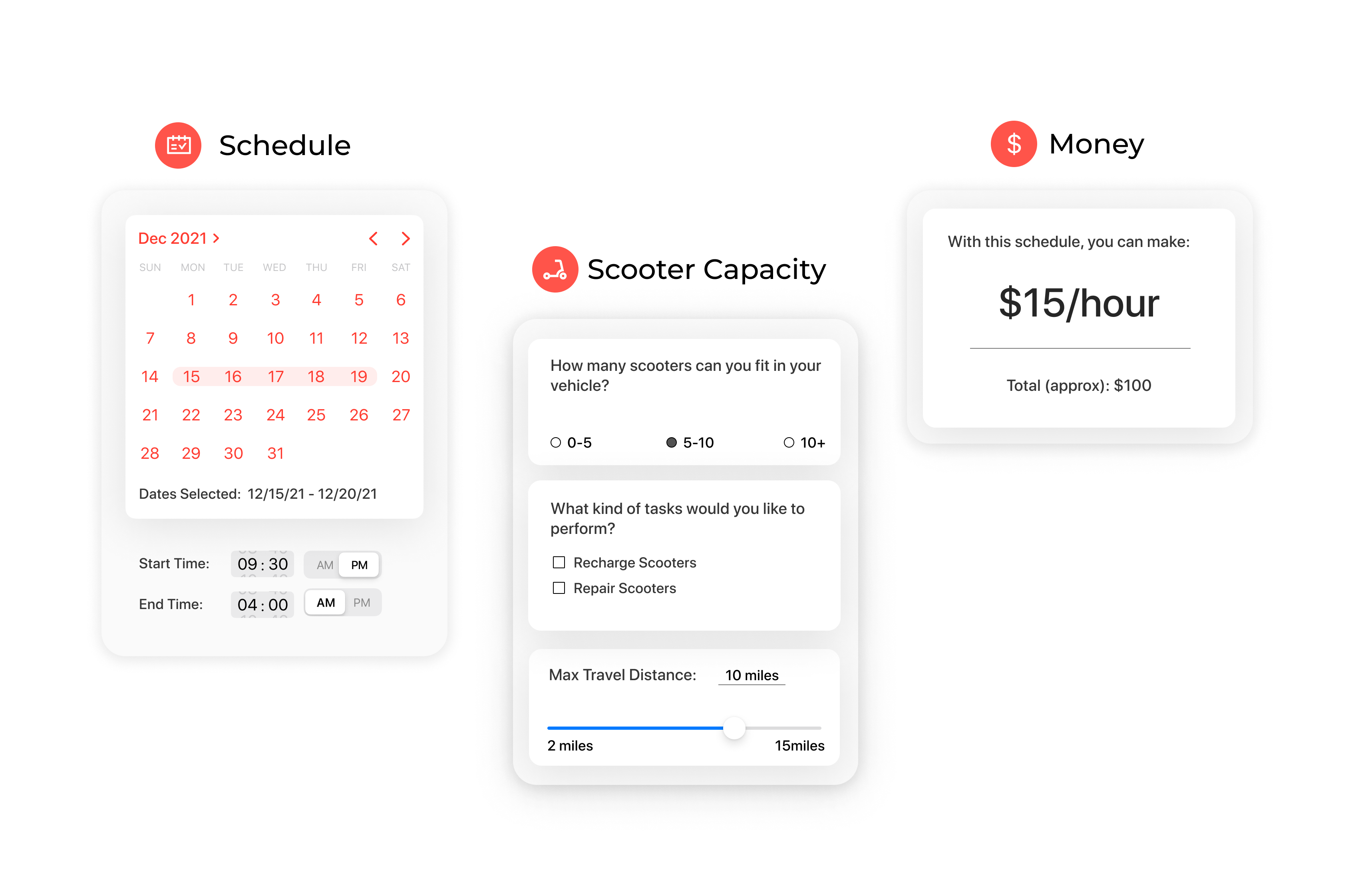
To start the design process, we carried out a quick brainstorming session with the team where we all sketched out individual ideas for layout and visualizations. I then consolidated the strengths of all the sketches into an annotated wireframe that specifies the layout as well as placement of the different metrics, which was helpful in realizing the best flow of the dashboard.
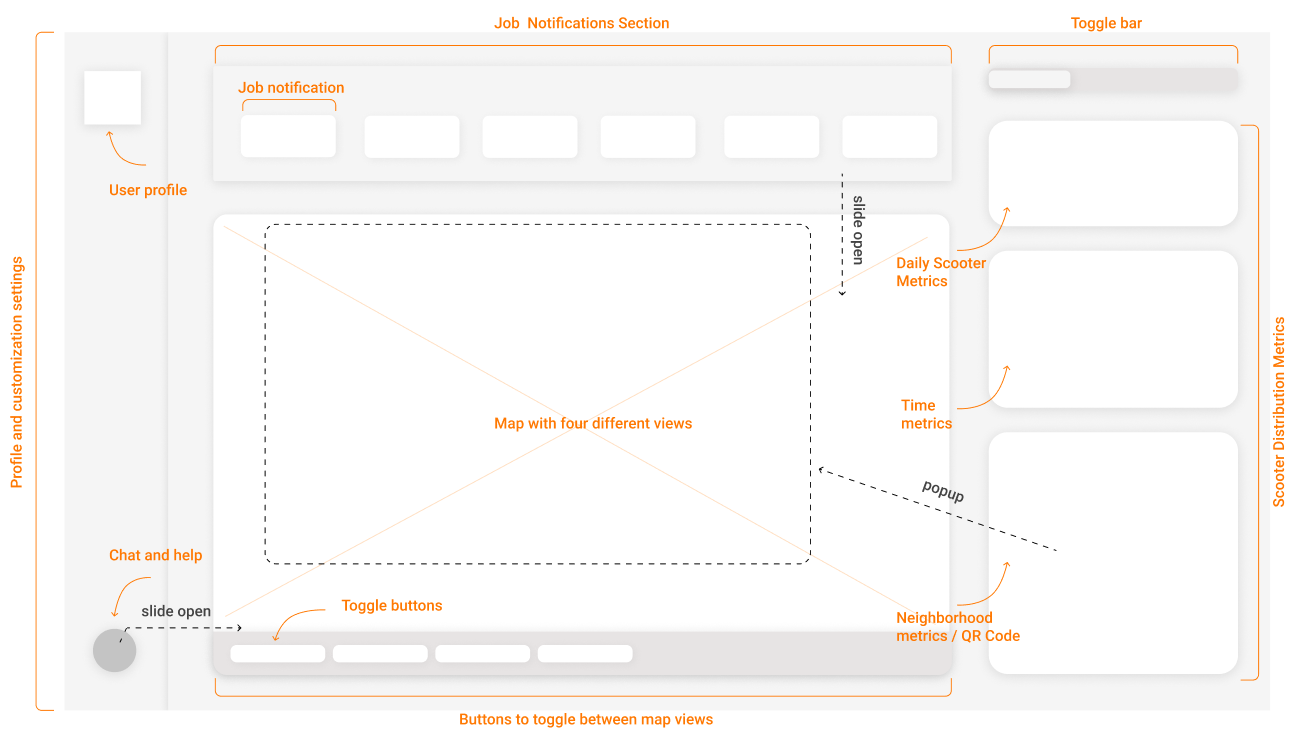
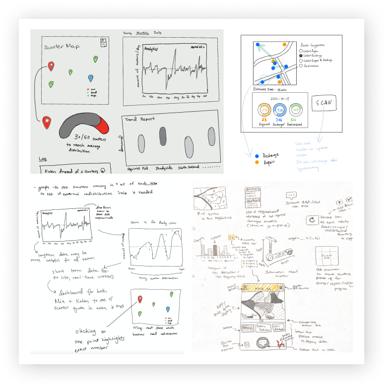
After laying out the fundamental grid and layout of our dashboard, we worked in two sprints to start developing data visualizations and populate the dashboard with all the visuals and the metrics. I led the sprint-style work sessions in order to reach an appropriate level of fidelity for usability testing.
.gif)
We conducted a task-based usability testing method to evaluate the design and effectiveness of our prototype. To make the usability testing as realistic as possible, I recruited two gig workers as our participants. I was able to identify key changes that we had to make in our next iteration through this process.
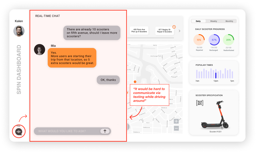
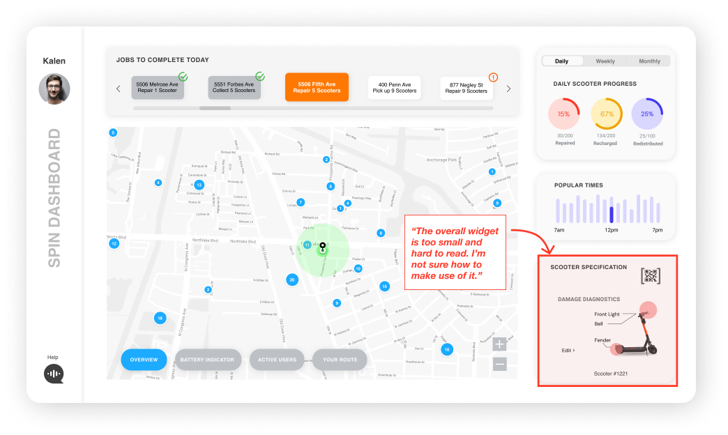
While it seemed like our proposal was developing multi-flow value creation, we went back to our stakeholder map and realized that the city policymakers' considerations were not met. Monitoring data and distribution to reach locations with limited access to other transportation options is a key goal for city policymakers. While this consideration can be addressed by the algorithm, it also can appear in the incentives offered to the gig worker when making a job request.
.jpg)
The process of iterating and testing informed the design of our final prototype. We also incorporated motion design at this stage to make present a dashboard experience that is more fluid. Some key features that we focused on are: task manager, chat assistant, scooter activity visualizations, and the job requests form.
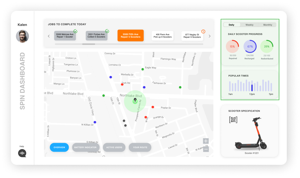
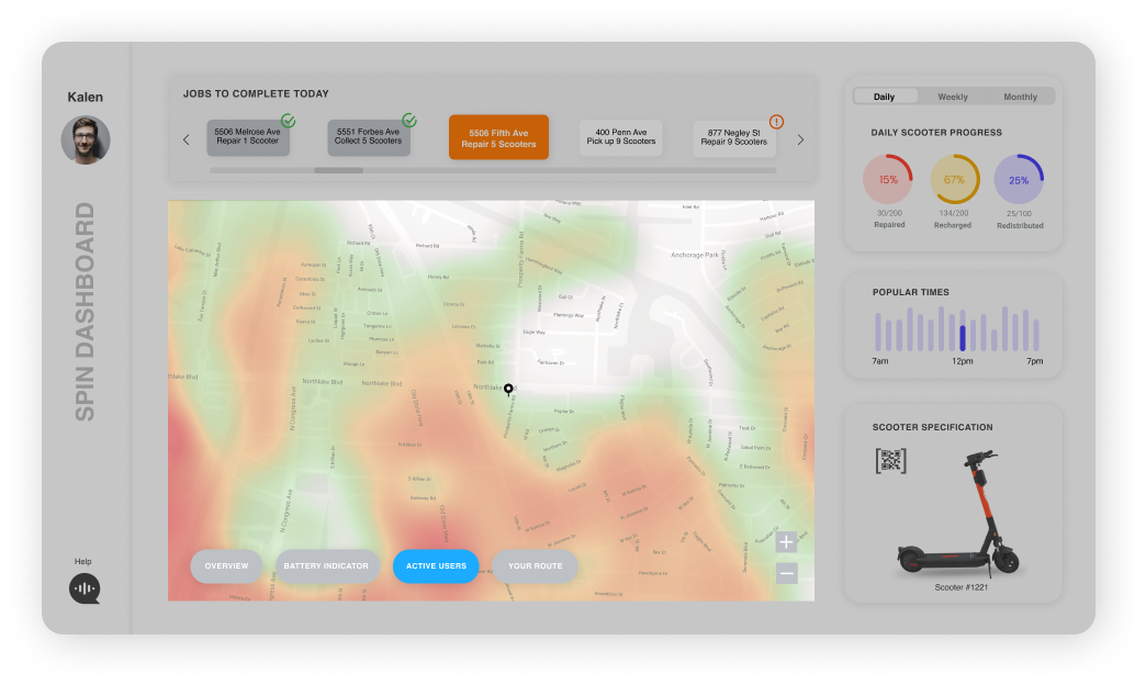
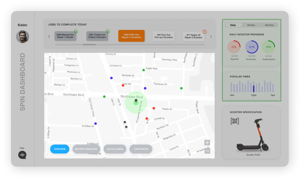
The image below highlights all the essential features of the final dashboard prototype.

I also designed the dashboard in a dark mode so that the user has the option to pick a mode of their preference.


The user benefits from having a clearly labeled and organized dashboard that allows them to gain quick insights. The gigs are coordinated based on user, company, and the city needs to ensure equal distribution of scooters across the city.
Data is ubiquitous in today’s age and prior to this project, I felt like I lacked the necessary exposure to data-driven design. However, this project helped me develop a strong foundation in data visualization and dashboard design. Moreover, I also learned about motion design and how to use it to complement data-driven designs.

